Examining The Color Psychology Of Brand Messaging
Comments Off on Examining The Color Psychology Of Brand Messaging

How much stock do you put into your company logo’s color? Believe it or not, the color scheme chosen for a brand’s messaging plays a huge role in the ways in which members of the public perceive the brand.
In fact, a study published in the journal, Management Decision reveals that people make decisions within 90 seconds of their first impression of a product. As reported by the University of Southern California, “color alone contributes up to 90 percent of the information that forms the decision. This suggests that marketers must understand how the colors they use affect consumers’ ability to differentiate products and identify brands.”
It’s wise to not underestimate the psychology of color when it comes to brand messaging. Let’s take a look at its impact. You may not be surprised to discover that the primary colors – blue, red and yellow – are among the most commonly used colors for branding.
Blue.
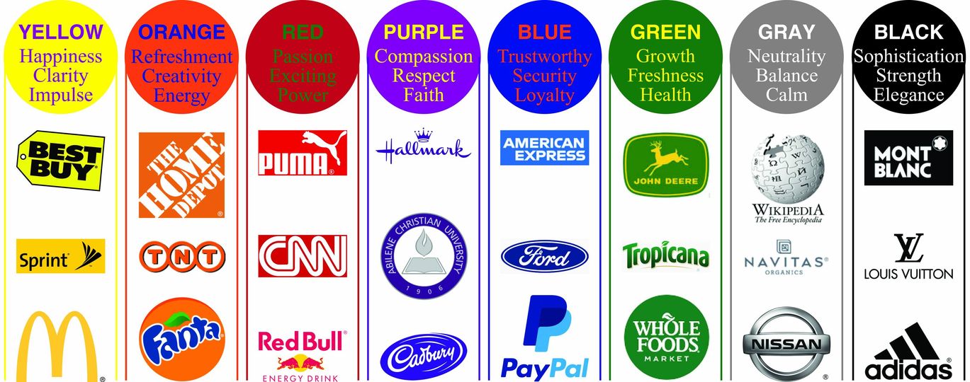
Blue is arguably the most popular of all colors. Known to convey loyalty, trust and intelligence, blue is utilized by some of the world’s most popular brands and highly successful businesses. Among them are Ford, Walmart, American Express, Dell, PayPal and Pfizer. Not to mention, two of social media’s most largely used platforms, Facebook and Twitter, have blue logos.
Red.
Red is very bright and bold. Brands that use red tend to evoke such emotions as strength, passion and excitement. Major food brands such as KFC, Coca-Cola, Red Bull, Wendy’s, Dairy Queen, Pizza Hut and Chick-Fil-A are well known for the use of red in their branding. Red also connotes power. Perhaps this is why such major corporations as Virgin, Netflix and CNN utilize red logos.
Yellow.
Yellow is bright and happy. The color we associate with sunshine is known to convey happiness, clarity and impulse among viewers. It is also a popular choice for marketers who wish to connote high energy, positivity and optimism. Such well-known brands as McDonald’s, Ferrari, Best Buy, Subway, Shell and Sprint are recognized for their uses of yellow in their branding.
Green.
Green is a relaxing, natural color. It suggests environmental consciousness. Branding that incorporates green evokes such emotions as freshness, growth and safety in their viewers. Brands like Tropicana, Whole Foods, John Deere, Animal Planet, Starbucks, Spotify and Android all have green in their logos.
What is the power of combining colors?
Naturally, combining your favorite colors can be very effective. McDonald’s, for example, utilizes both red and yellow. The pairing suggests a combination of passion, excitement and happiness. Consider, if you will, the use of blue and orange in the Stellar Signs & Graphics logo. The blue connotes our company’s trustworthiness, while the orange helps us to convey our creativity.
The signage experts at Stellar Signs & Graphics would be happy to discuss color psychology in your branding ideas with you. We proudly serve the business communities in and around Palm Beach County, West Palm Beach, Royal Palm Beach, Wellington, Lake Worth, Boynton Beach, and Greenacres, Florida. Please don’t hesitate to give us a call at 561-721-6060 today!
Tags: blue, branding, color psychology, colors, company branding, company logo, green, logo, red, signage, signage design, signs, yellow
Categorised in: Branding Signs, Custom Signs, Signage Planning
This post was written by Bonnita Calhoun
