Less Is More When It Comes To Effective Signage Design
Comments Off on Less Is More When It Comes To Effective Signage Design

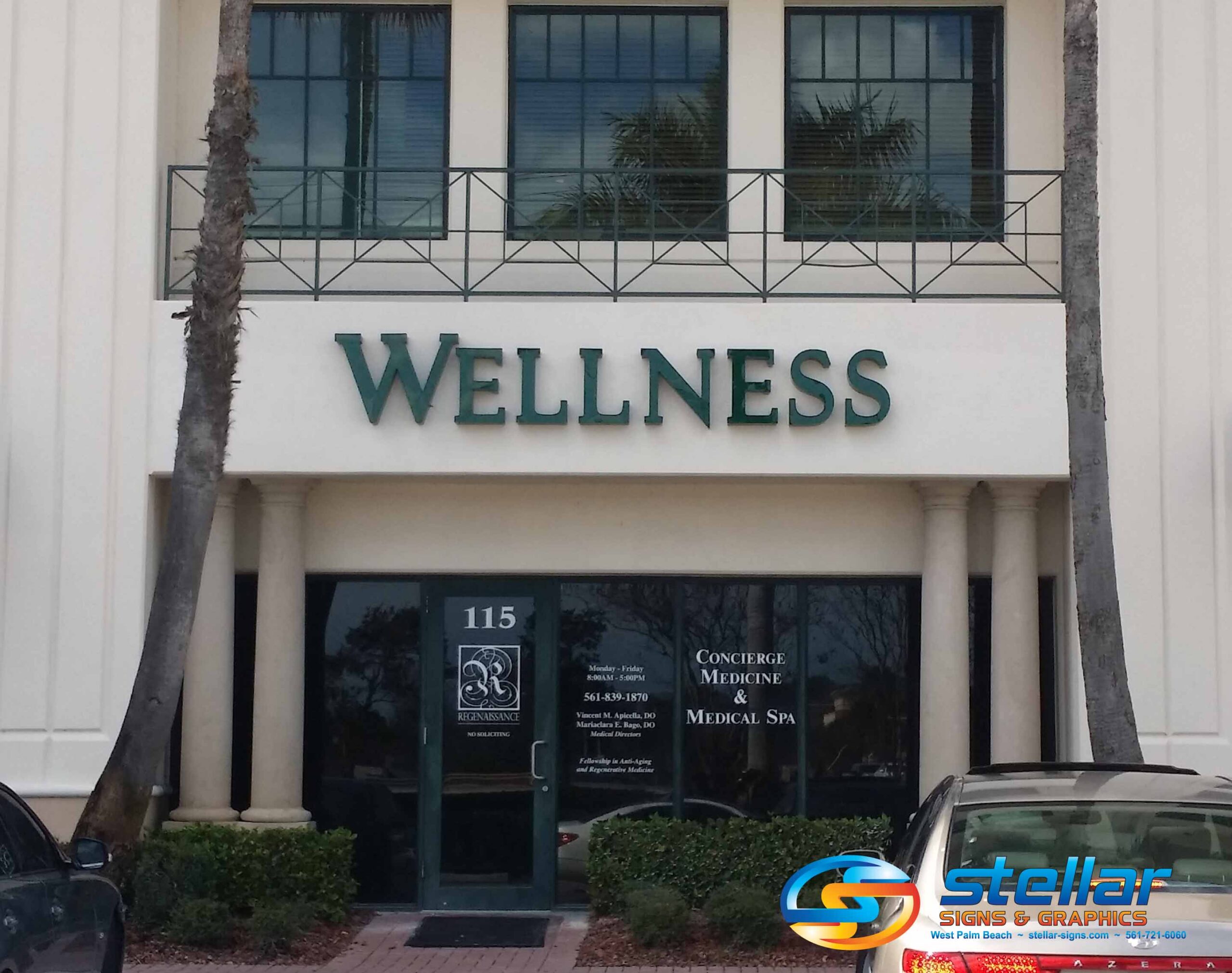
There is no question that all companies require signage. Without it, a place of business is just a building. What’s inside it is anyone’s guess. With effectively designed signage, however, passers-by are immediately made aware of a company’s existence. However, strong signage is so much more than a location marker. It communicates the prestige, quality and reputation of a brand. A store’s sign is a top reason why consumers choose to enter.
“Retail and shop signs are the easiest way to attract shoppers and help them find your business,” affirms Michael Keenan on Shopify.com, “Consumers learn and assume all sorts of things about your business based on its signage. Your outdoor signage works with window displays to pique curiosity and encourage customers to come inside.”
How much does the quality of a sign matter?
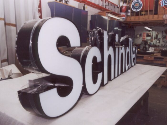
It’s a silly question, right? Keenan reports that, according to the Sign Research Foundation (SRF), 61% of U.S. consumers failed to find a business because its sign was too small or unclear. So, not only does size matter, but quality counts as well. It’s important to manufacture signage using top-quality materials. Just one benefit is that the sign will be able to withstand extreme weather conditions and not appear dilapidated within weeks of it being installed.
There are other questions that need to be answered when considering the quality of your sign. Are the colors vibrant or dull? Is the font easy to read or hard to look at? Have you come up with an eye-catching design or is it an eyesore? In many cases, the ideal rule of thumb to live by is “less is more”.

How does the “less is more” approach improve a sign’s quality?
The more distinct the text on your sign, the clearer its message will be. Understandably, some business owners wish to communicate as much information as they can in the spaces their signs provide. But can passers-by read it all? Consider that many readers of your store’s sign will be driving by in their cars. If they can’t consume all of the information provided, they may lose interest in the message.
LinchpinSEO.com highlights the prediction that minimalism in design is a top printing industry trend for 2023. “For years, designers have opted for complex designs created to capture attention and get as much information as possible,” says the site, “This has been changing recently, as customers prefer more minimalistic designs. Companies that offer a design service alongside their printing will need to focus on clean, crisp images that still come across as elegant.”
Are you ready to get a new sign for your store?
Please don’t hesitate to contact the experts at Stellar Signs & Graphics. Our team is highly skilled at producing images with stunning color and clarity. We use state-of-the-art equipment and eco-friendly water based latex inks to produce a large format print image of the highest quality available.
We proudly serve the business communities in and around Palm Beach County, West Palm Beach, Royal Palm Beach, Wellington, Lake Worth, Boynton Beach, and Greenacres, Florida. Give us a call at 561-721-6060 today!
Tags: colors, customers, font, less is more, printing trends, quality, signage, signage design, signage quality, size, storefront signage
Categorised in: Signage Planning, Storefront Signage
This post was written by Walkiria Gutierrez
