4 Things To Consider When Designing Your Channel Letter Sign
Comments Off on 4 Things To Consider When Designing Your Channel Letter Sign
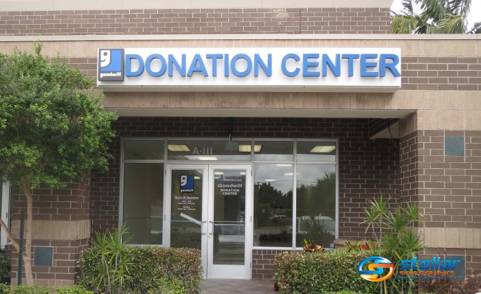
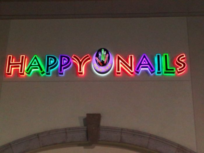
 Channel letter signs are among the most popular ways to show off a storefront. The spectacular combination of that “3D effect” of having letters pop out from their backgrounds and LED illumination make channel letters hard to beat. At Stellar Signs & Graphics, we manufacture the body of each channel letter from lightweight, yet sturdy aluminum that doesn’t rust or get damaged by insects and inclement weather.
As well, we use colorful acrylic that helps for your sign to get noticed from far distances. This is one of the biggest benefits of utilizing channel letters to adorn your storefront. Their vibrant and eye-catching qualities make them visible from far away – even through obstructions like trees and traffic!
There are, however, some important things to consider when designing your channel letter sign. Here are four:
1. Stick with easy-to-read fonts.
Even if your business logo isn’t made up of all capital letters – which is often recommended – you’ll want your channel letter sign to be made up of a bold and distinct font. In the world of signage, it’s usually best to avoid script or cursive writing and stick with separated, printed letters. Big, bold and distinct lettering is considered easier to read.
 2. Go with vibrant colors.
You’ll definitely want the color of your channel letters to contrast with their background. However, it’s best to avoid dark colors such as black, navy, army green or maroon as they are simply harder to see. As well, because of their darkness, they tend to absorb light rather than emit it. This will dampen the illumination effect intended by the LED lights behind the channel letters.
3. Determine a good position for your sign.
Generally speaking, channel letter signs are placed well above the front doors of a place of business. However, it’s wise to consider the location of your business when determining the location of the sign. A poorly positioned sign will decrease its effectiveness. Consider the typical distance from which the sign will be read. This will help you to determine an adequate size for the letters as well as ideal positioning.
 4. Settle on a lighting option.
At Stellar Signs & Graphics, we offer three lighting options for lit channel letter signs: front lit, back lit and halo lit. But which one is the best choice for your sign? The experts at Stellar Signs & Graphics can certainly help you to make the right choice!
Let’s get started on your channel letter sign! We serve the business communities in and around Palm Beach County, West Palm Beach, Royal Palm Beach, Wellington, Lake Worth, Boynton Beach, and Greenacres, Florida. Give us a call at 561-721-6060 today!
Tags: channel letters, How to Utilize Channel Letters For Your Storefront in West Palm Beach FL, Illuminate with Channel Letters in West Palm Beach FL, Where To Channel Letter Signs in West Palm Beach FL
Categorised in: Channel Letter Installation, Channel Letter Refacing Palm Beach Gardens FL, Channel Letter Signs, Channel Letters, Channel Letters Palm Beach Gardens FL
This post was written by Bonnita Calhoun
