How To Successfully Design An Eye-Catching Sign
Comments Off on How To Successfully Design An Eye-Catching Sign
One of the top objectives of installing signage at your place of business is to attract attention. To do just that, it’s important for your signs to draw eyes away from the other entities in your surrounding area. Is an eye-catching sign all about big letters and bright lights? Not necessarily. Let’s take a look into how to successfully design an eye-catching sign!
Avoid clutter.
We all know the saying “less is more”. When it comes to your signage, keep this idiom in mind. You don’t want your brand messaging to get muddied by having too many visuals. A signage design that looks cluttered may only create confusion and even a disliking of your business. As Annie Harrington of Canada’s Small Business BC points out, one of the most important parts of creating a sign is clean design that is easy on the eyes.
“If it’s poorly designed, it won’t be easy to read, and if it’s not easy to read, customers won’t pay attention to it,” she warns, “It’s that simple. Choose large, bold letters for the sign copy and simple, easy to recognize graphics (like a company logo or symbol such as $ or %).”

Keep it consistent.
Your sign may be attractive. But does it match up with the rest of your company’s marketing materials? To make strong impressions on the public, it’s vital that you keep consistent. Your fonts, color schemes and designs should all be the same no matter where they are seen. From your website to your business cards to your storefront signage, your company’s branding has to make consumers 100% sure they have the right business.
“All too often a business will use hand-written ‘No Entry’ and ‘Out of Order’ signs, despite going to great lengths to create a consistent and professional visual tone throughout the rest of their building,” writes Paul Rea of U.K.’s Red Square Design, “But this can seriously undermine the visual standard set throughout the rest of the space.”

Make use of contrast.
Do yellow letters on a white background stand out? Does a purple logo pop on a black backdrop? When designing your signage, it’s important to remember that contrast is key. “Bright, bold contrasting colors like red and yellow are good choices because they are easy to see at a distance,” insists Harrington, “Use this to your benefit. Of course, you also need to select colours that make sense with your brand – you don’t want confuse your customers.”
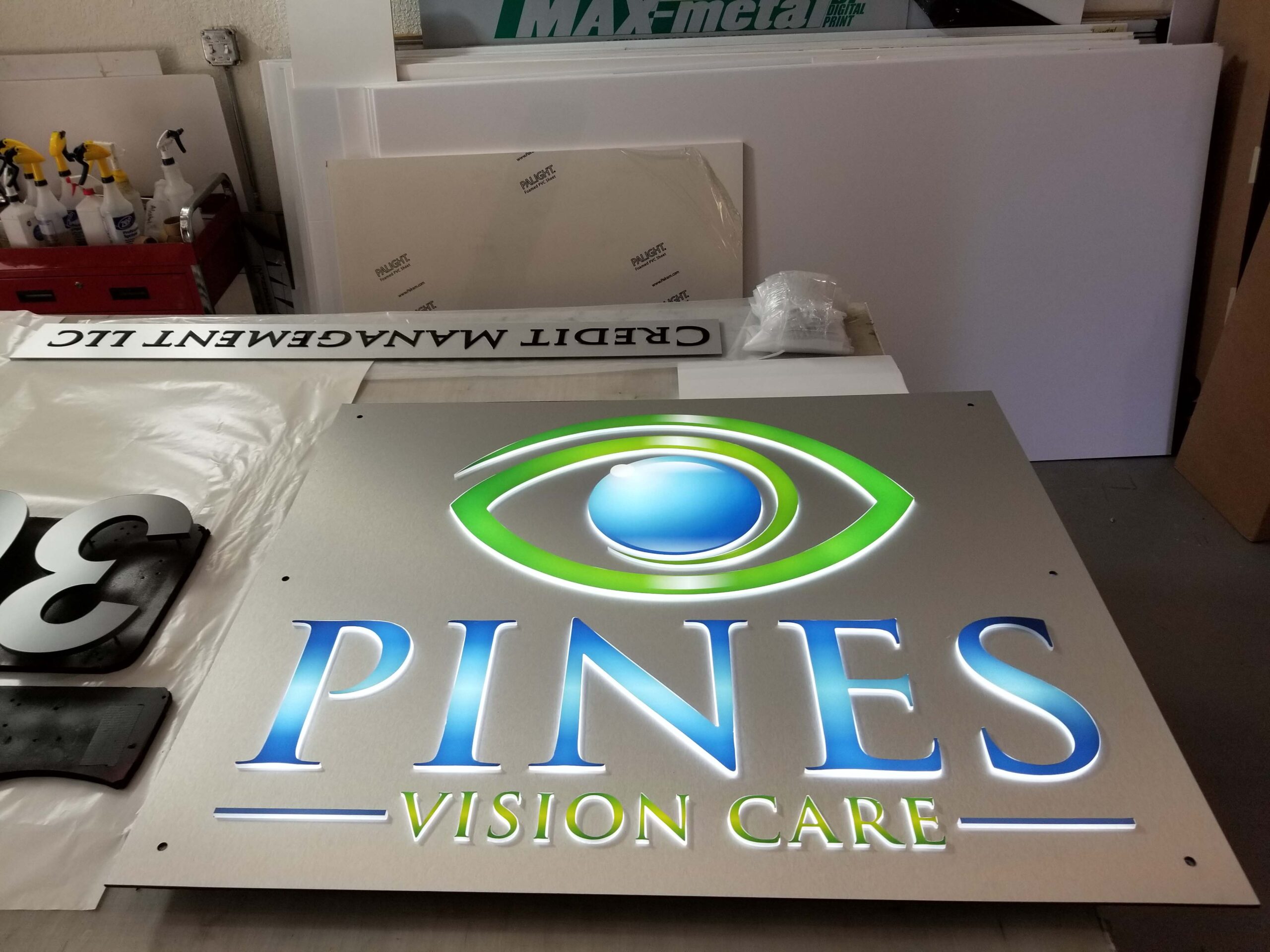
The signage experts at Stellar Signs & Graphics definitely know a thing or two about designing eye catching signs! We proudly serve the business communities in and around Palm Beach County, West Palm Beach, Royal Palm Beach, Wellington, Lake Worth, Boynton Beach, and Greenacres, Florida. Give us a call at 561-721-6060 today and let’s discuss the design of your company’s new sign!
Tags: clutter, color, consistency, eye-catching, eye-catching signs, font, Lobby Signs, monument signs, signage, signage design, signs
Categorised in: Signage Planning, Storefront Signage
This post was written by Bonnita Calhoun