What Are The Most Important Elements Of Your Storefront Sign?
Comments Off on What Are The Most Important Elements Of Your Storefront Sign?
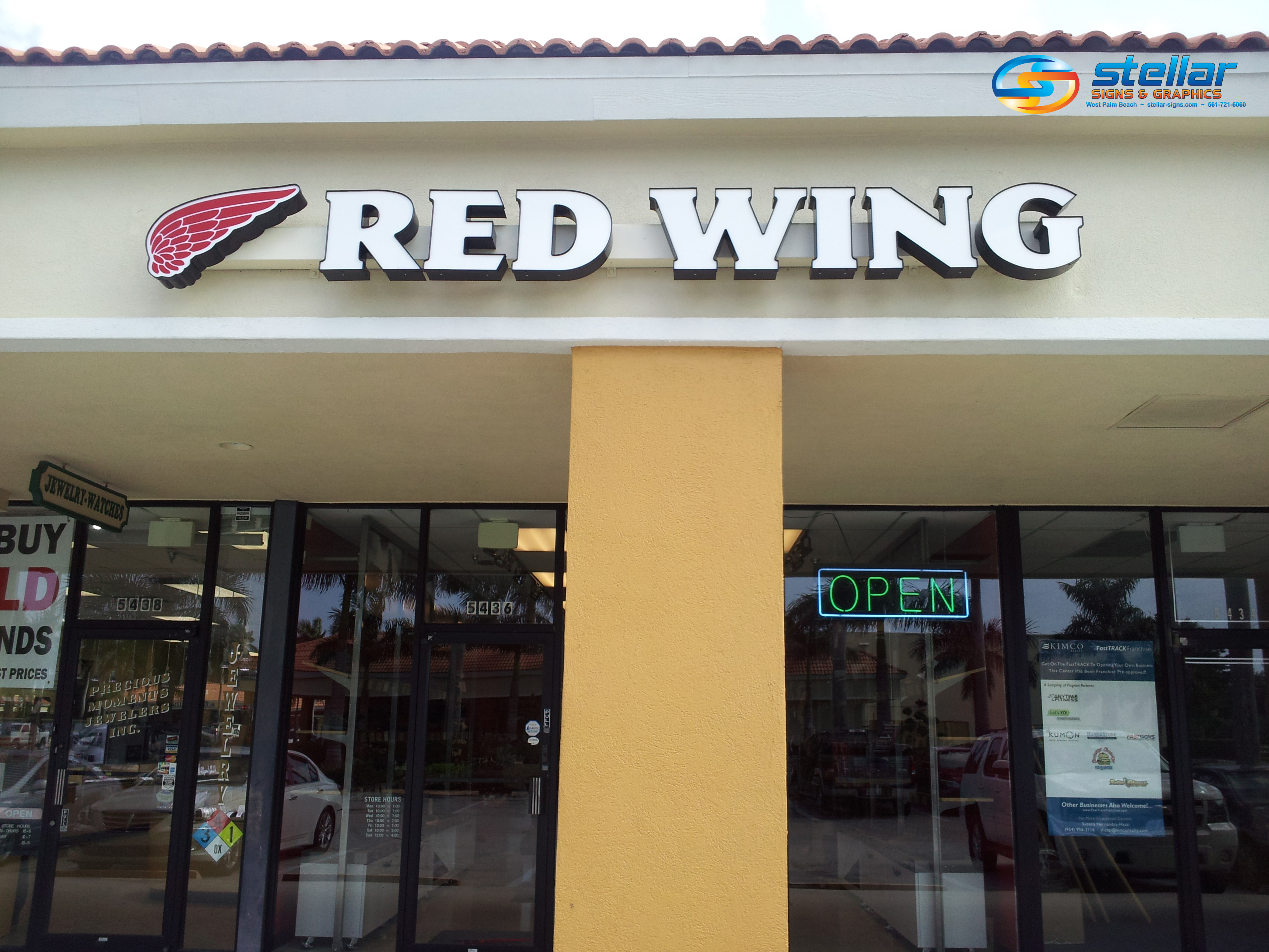
The significance of your storefront sign should never be underestimated. It’s literally the first thing people see when they approach the front doors of your place of business. And, for those who may not be approaching it at all, your storefront sign is a beckon to those who may be in the vicinity. The bottom line is that your storefront sign’s ability to attract eyes plays a huge role in just how many customers your store welcomes.
“A storefront sign gives your store a good first impression and ensures that people can see your business day or night,” reports Maggie Aland on FitSmallBusiness.com, “There are various options in terms of materials, size, and design. Because your signage is one of the first things a potential customer sees, you must choose one that reflects your brand, products, and services.”
There are three incredibly important elements of a storefront sign for you to pay attention to when creating its design: its color, its size and its ability to contrast from its background.
The color needs to be compelling.
The difference between vibrant and dull means the world when it comes to signage. In fact, many brands are known for their color choices. What color comes to mind when you think of Coca-Cola? Red, right? How about McDonald’s? Those yellow arches are hard to miss. As Jason Fell points out on Entrepreneur.com, color can often convey a brand’s identity.
Does size really matter?
It sure does! It should probably go without saying that the larger your storefront sign’s letters are, the easier they will be to read. As Fell explains, “this is especially important if you’re creating roadside signage or signs that will be displayed at a significant distance — at a conference, for instance.”

A sign’s contrast often determines its readability.
How visible is your sign against its background? Is it illuminated, thus enabling it to be viewed at night? Contrast is a huge factor when it comes to creating an eye-catching storefront sign. “You might consider a dark color on a very light background, or the opposite of that — black on white or white on blue,” suggests Fell, “Pairing similar colors can decrease a sign’s readability.”
Contact the experts at Stellar Signs & Graphics to discuss the storefront sign design that would work best for your business. We proudly serve the business communities in and around Palm Beach County, West Palm Beach, Royal Palm Beach, Wellington, Lake Worth, Boynton Beach, and Greenacres, Florida. Please don’t hesitate to give us a call at 561-721-6060 today!
Tags: channel letters, color, contrast, readability, size, storefront sign, storefront signs
Categorised in: Channel Letter Signs, Channel Letters, Signs for Mall Stores
This post was written by Bonnita Calhoun